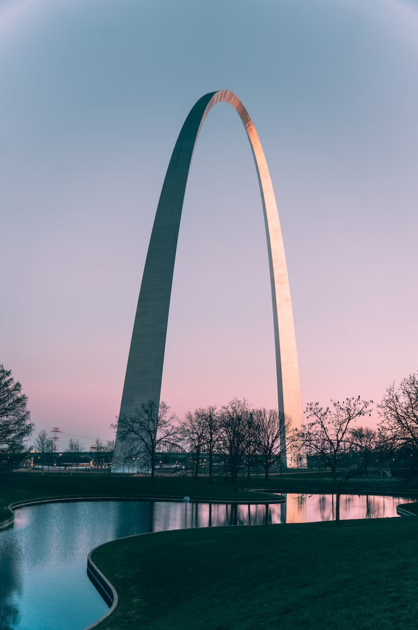
2019 | STL Metro
Designing for systems
Making public transportation in St. Louis easy and accessible.
STL Metro is a prototype that proposes a solution to a broken public transit experience. For those who rely on the Metrolink system of St. Louis, this app would serve as a tool to help them navigate the city with ease.
Starting with Legacy
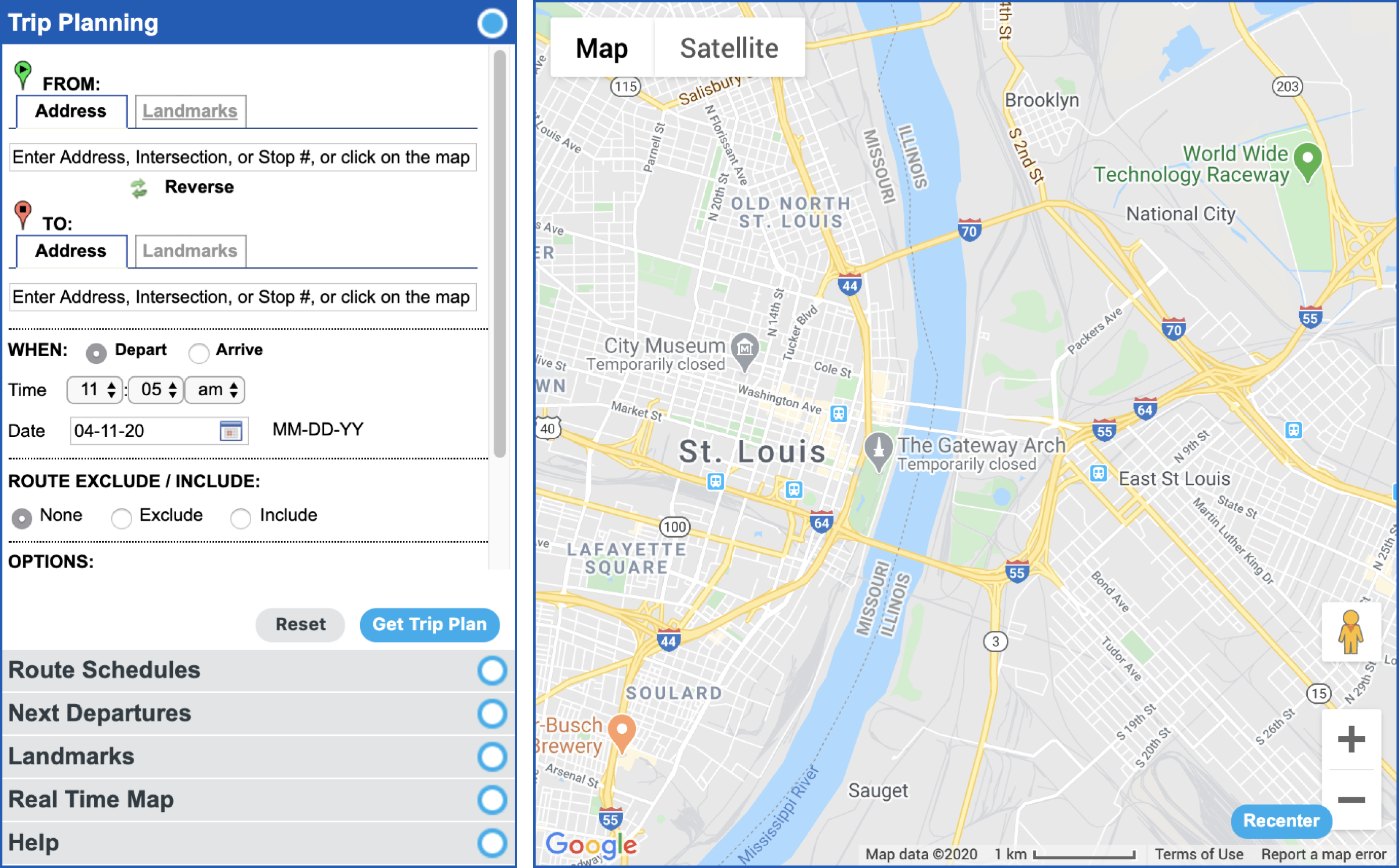
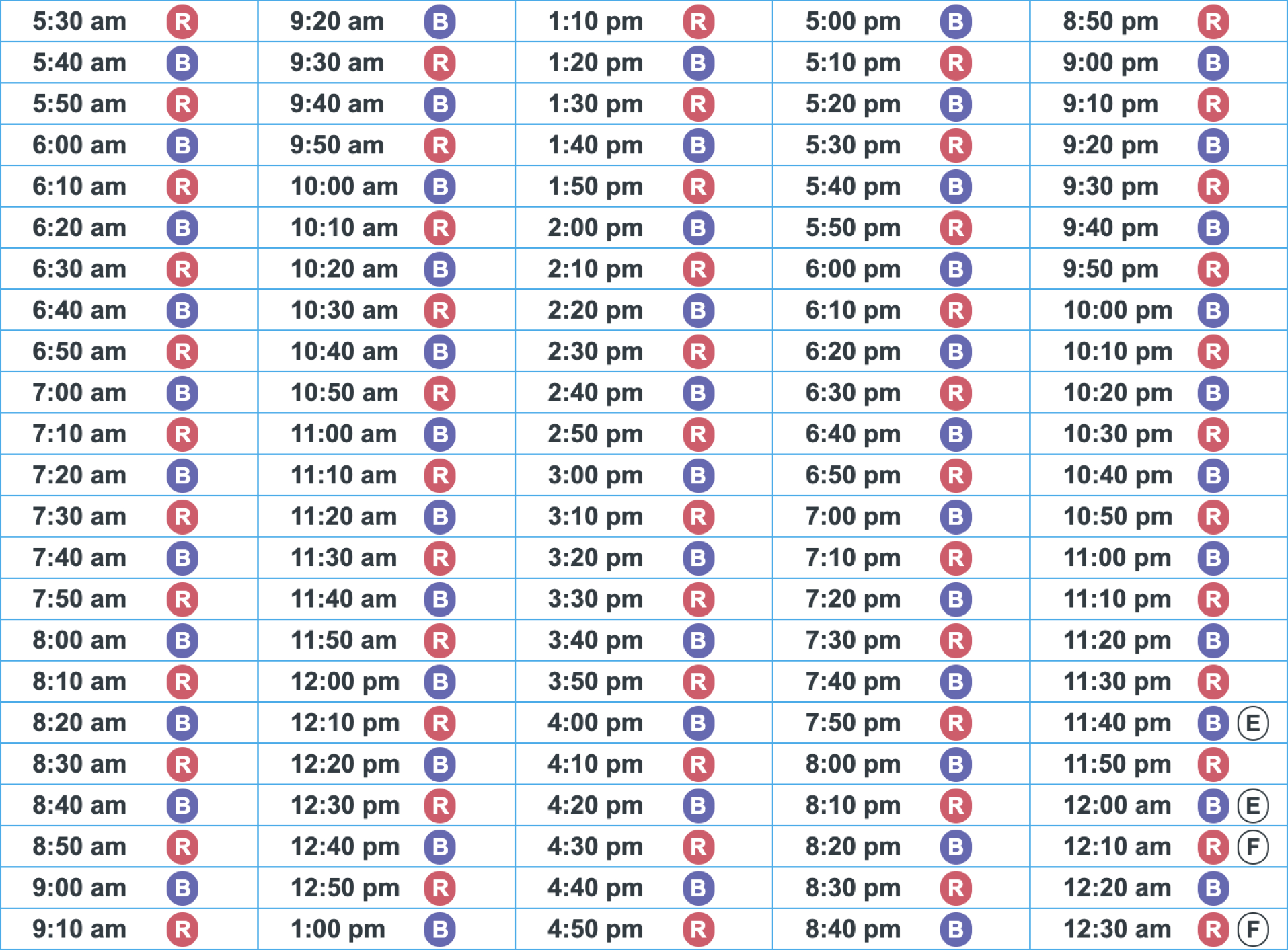
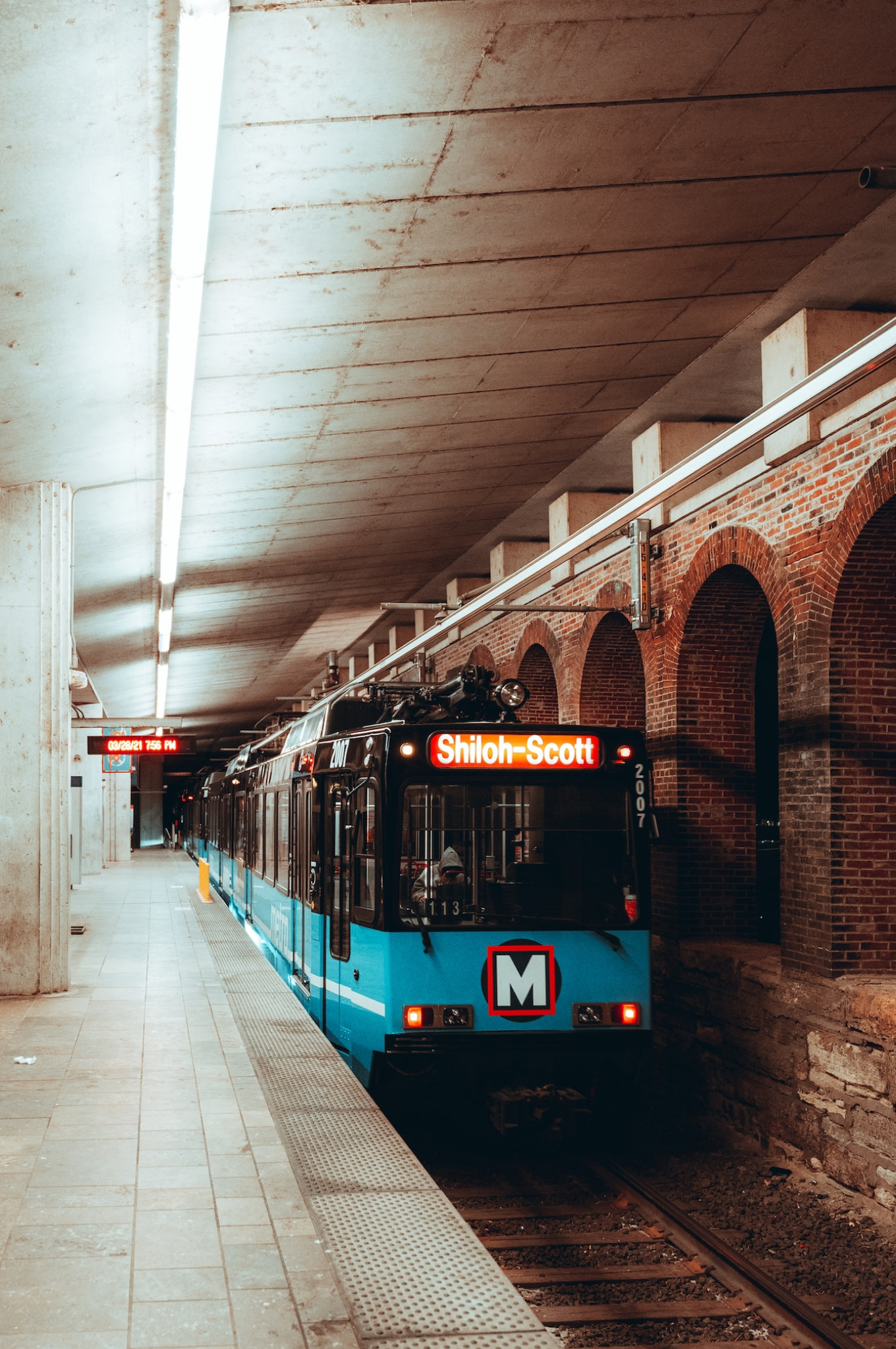
An inspection of the current system for guiding users through public transit reveals a confusing and overhwelming user experience.
Figuring out times and mapping a route with the official trip planner is not only difficult to use and aestheticaly unappealing but also requires manual sorting and recall from users.
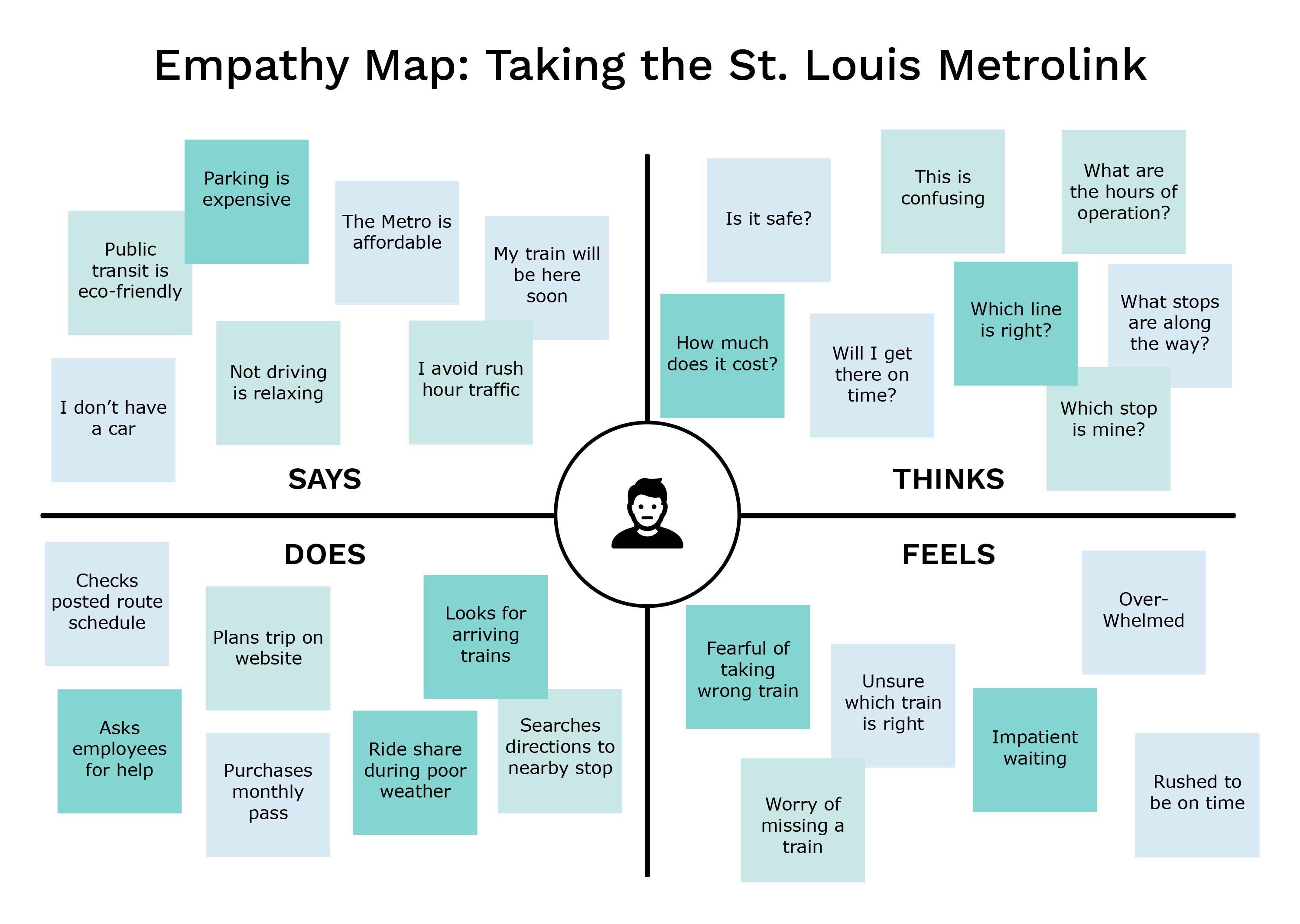
Mapping Empathy
To truly empathize with users that follow this system, I started using the St. Louis Metrolink regularly and taking advantage of public information. From first-hand experience, I was able to build an empathy map that aligns with users needs.
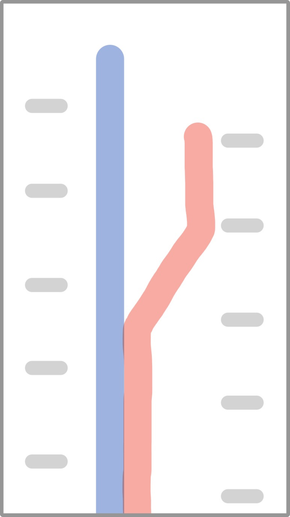
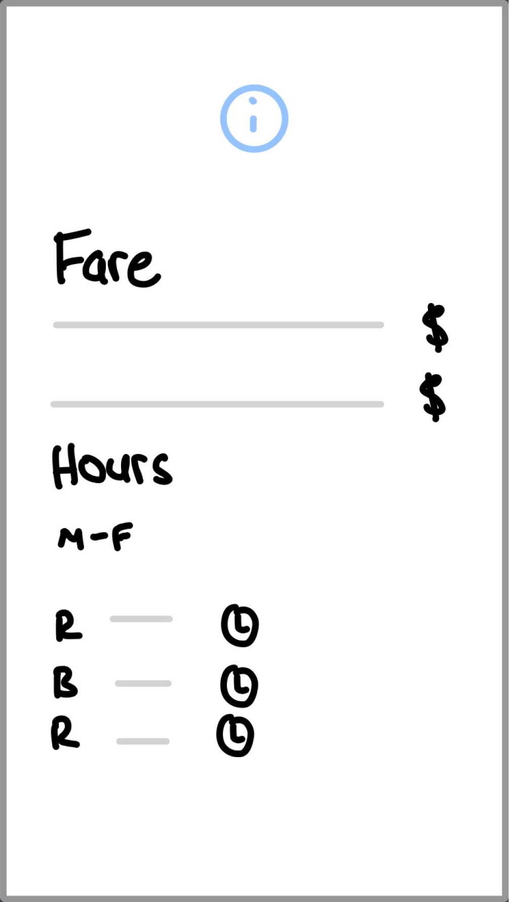
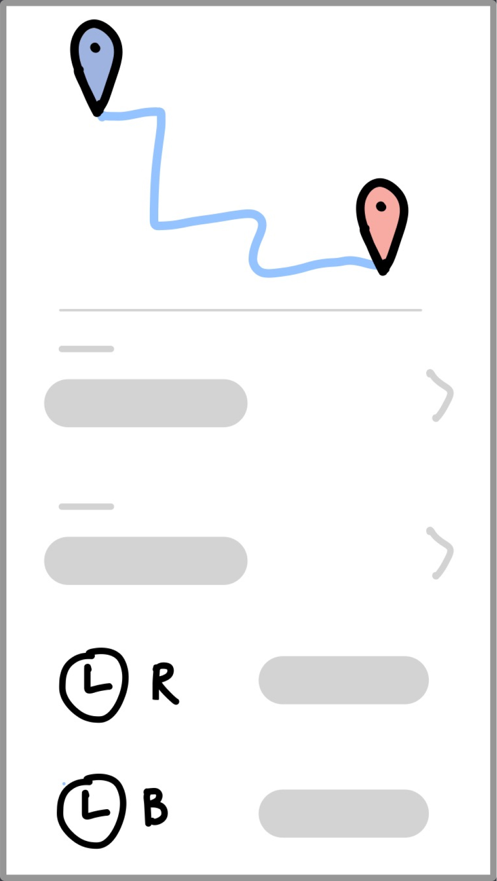
Bread Boards & Fat Marker Sketches
Instead of wireframes, my process utilizes breadboards and fat marker sketches. Creating rough drafts with a text based list of affordances allows for focus on the features and flow.
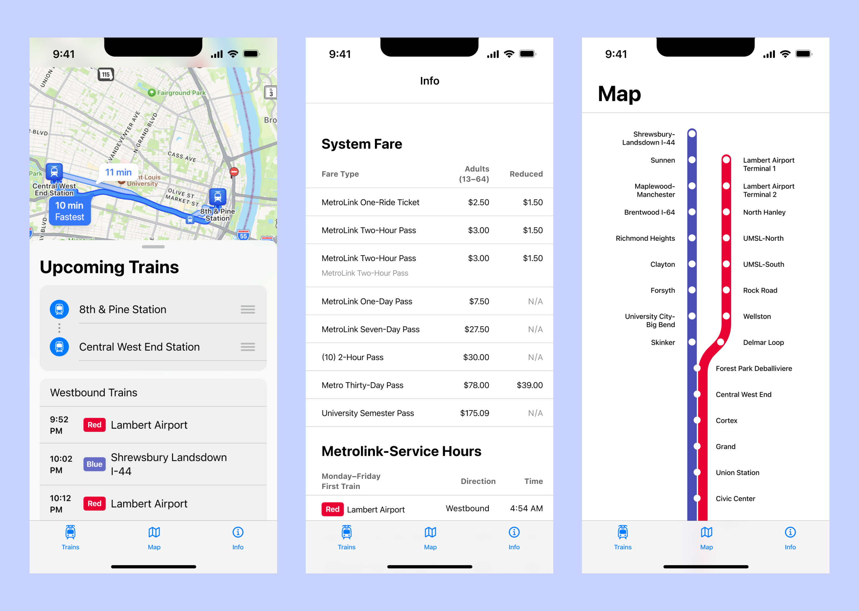
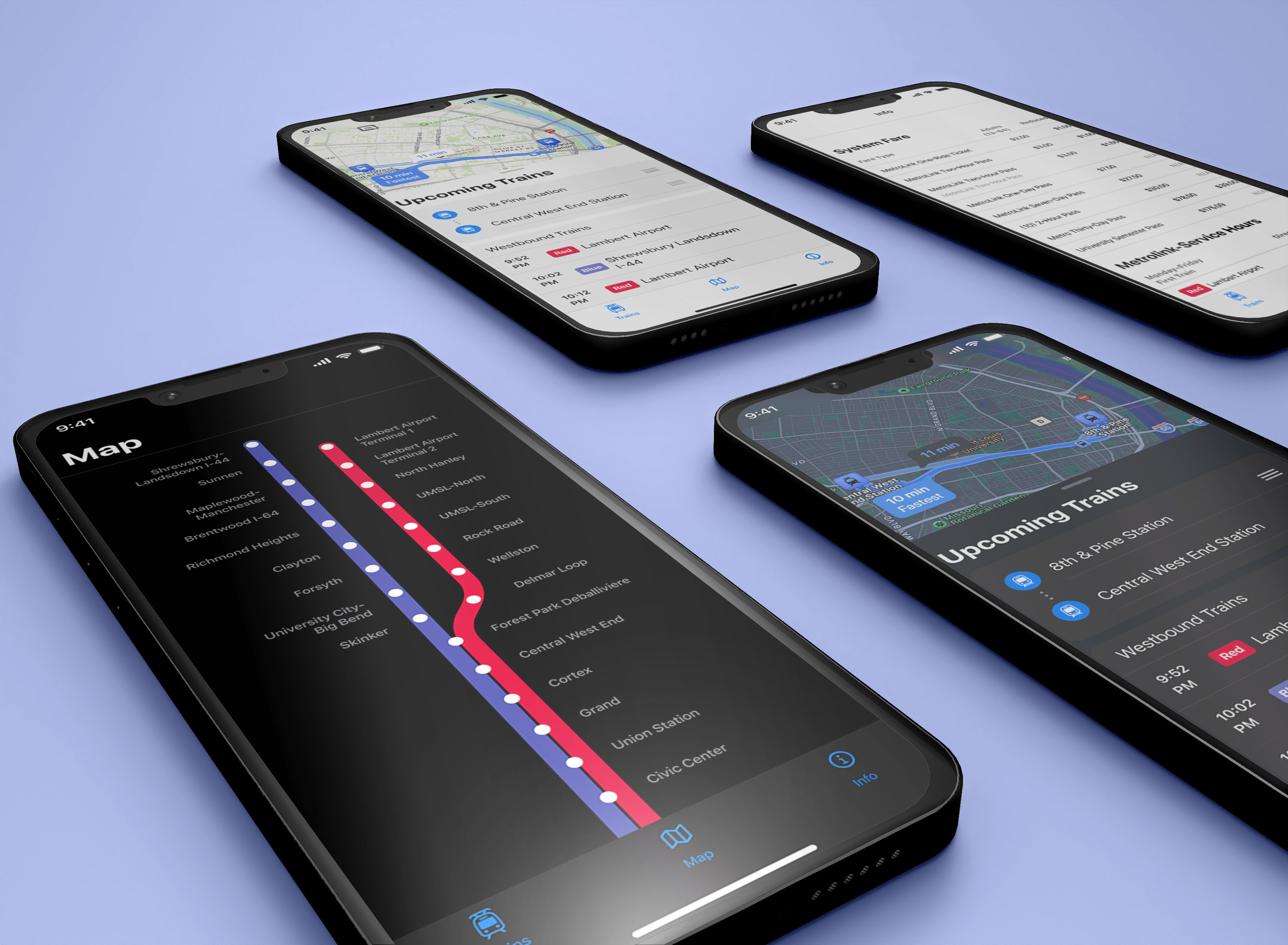
| Map |
|---|
| Map Design |
| Eastbound Trains |
| Westbound Trains |
| Info |
|---|
| System Fare Type |
| System Fare Price |
| Service Hours Days |
| Serivce Hours First Train |
| Service Hours Last Train |
| Trains |
|---|
| Directions with Map View |
| From Station |
| To Station |
| Line Direction |
| Upcoming Train Name |
| Upcoming Train Line |
| Upcoming Train Time |
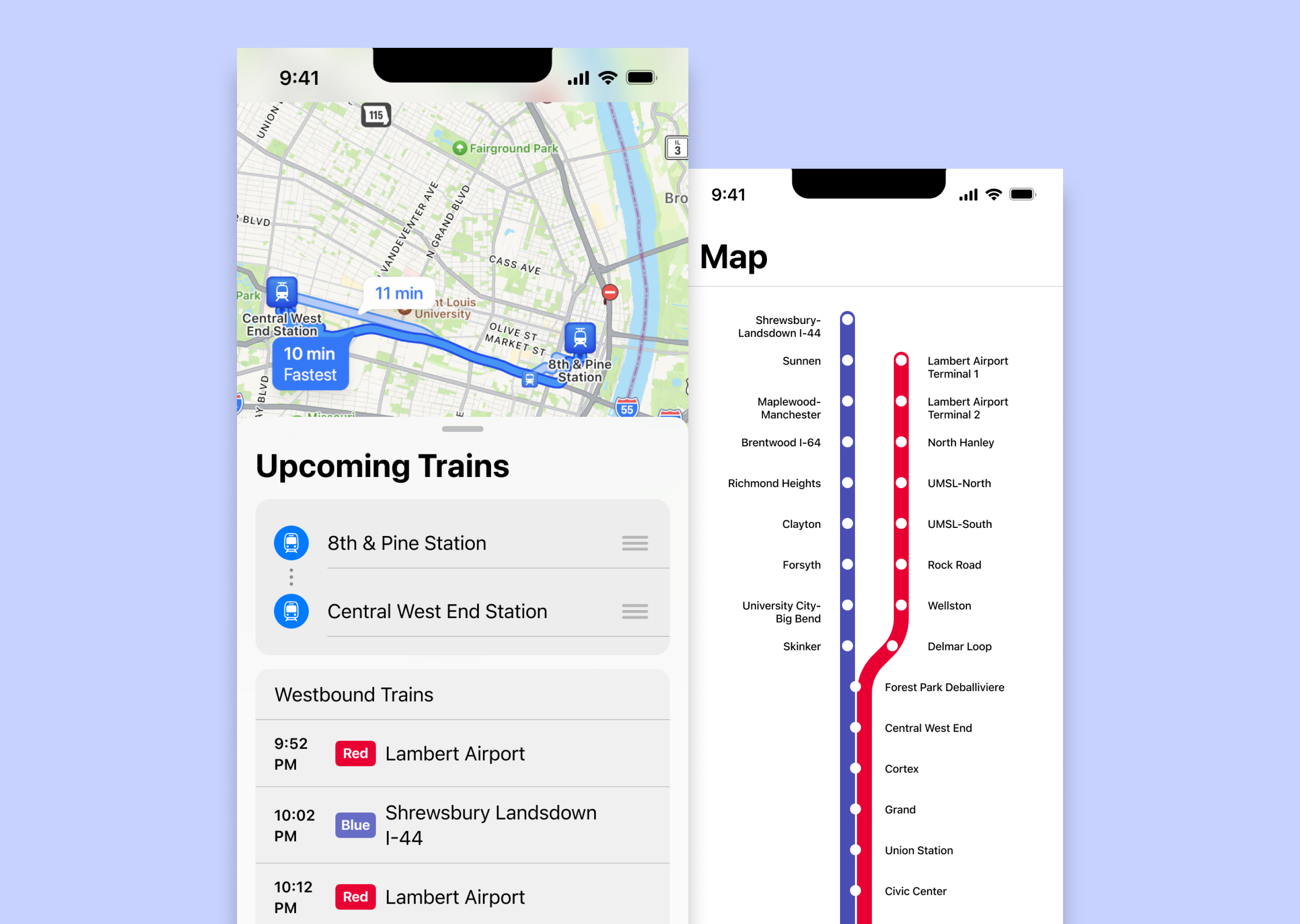
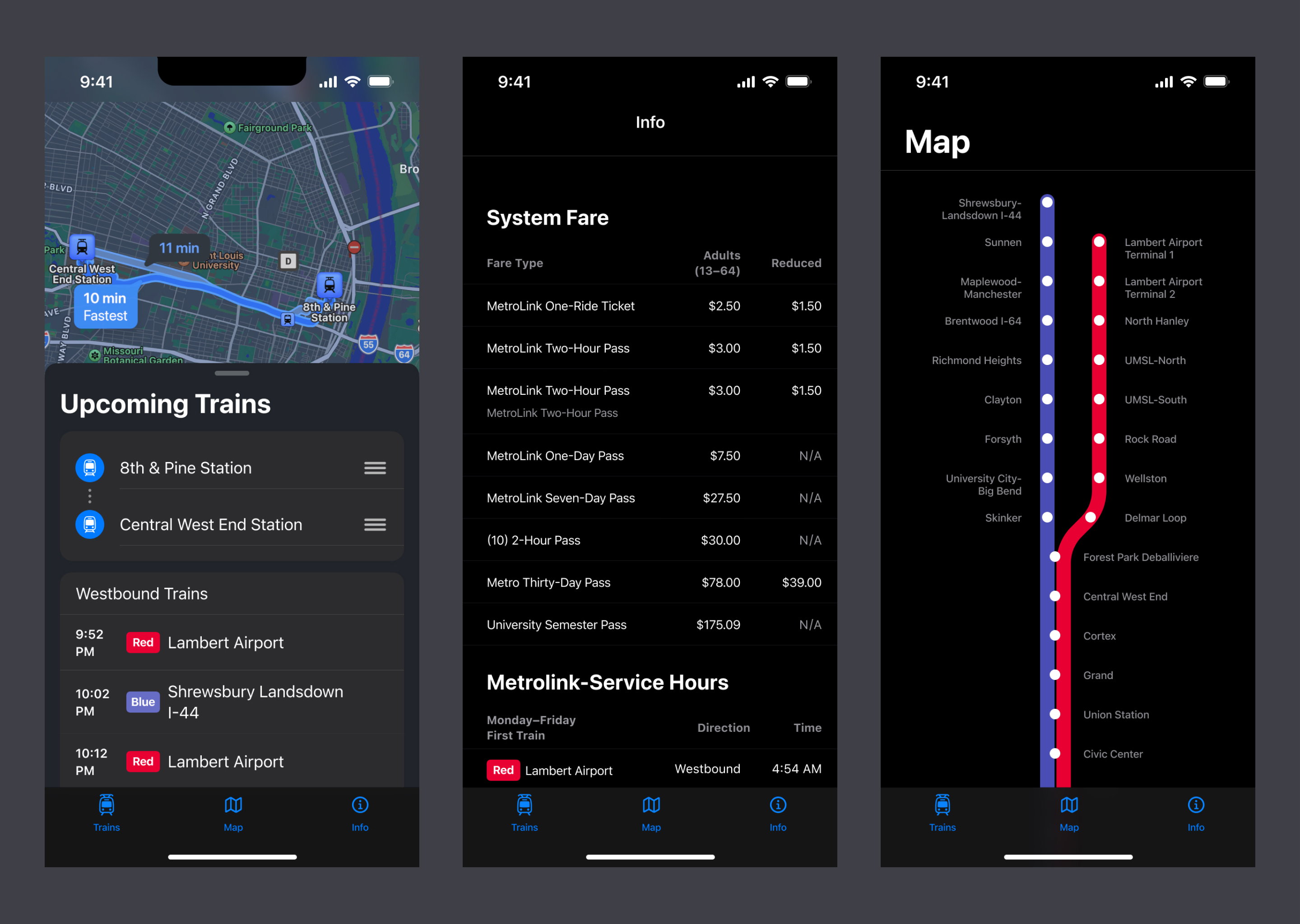
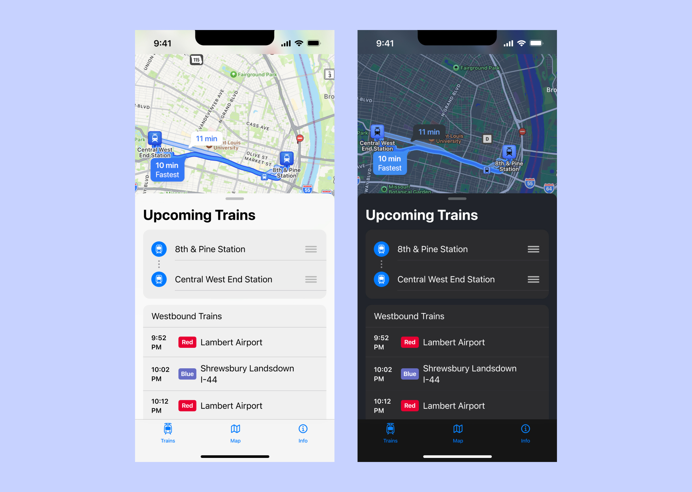
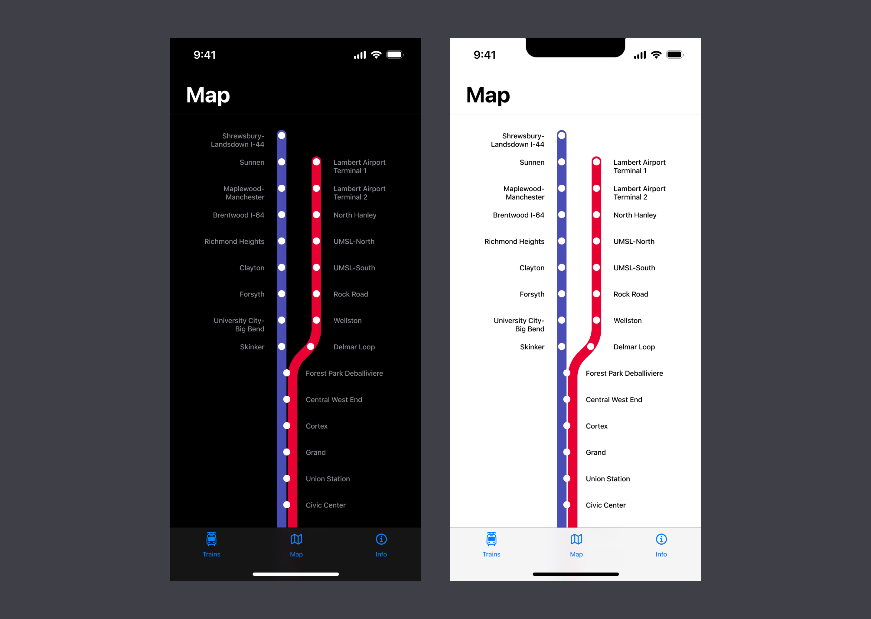
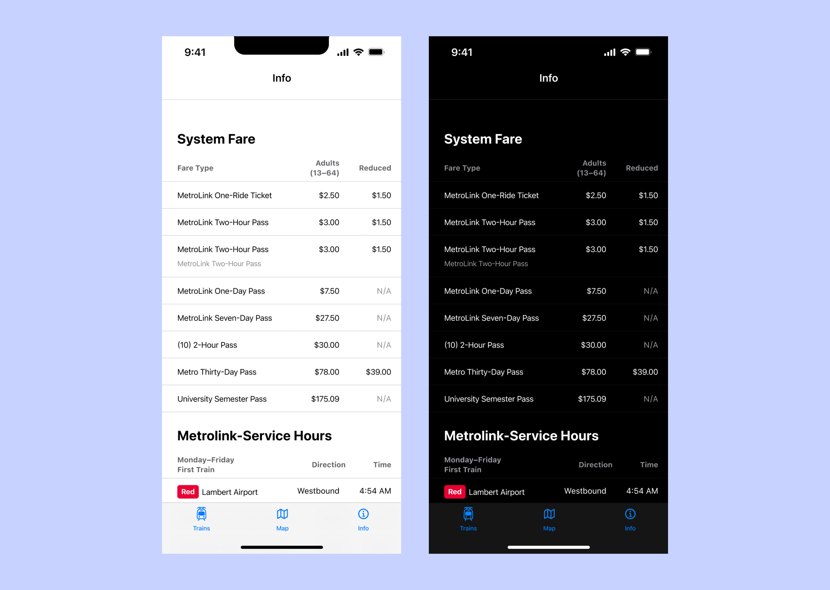
High Fidelity Design
With a solidified vision, the sketches and bread boards guided high fidelity mockups. Together, the mockups create an app with three views that propose a simple tool to help people navigate the St. Louis Metrolink system..
After finalizing the light theme designs, it was time to support dark theme users. Even though it's mostly a matter of tweaking color pallete, the dark theme designs look gorgeous and offer a lot of value in terms of usability.
Designing the Icon
After finishing the high fidelity design and prototype, it was time to design the app icon. To help make it clear what this app does, I opted for simple iconography that makes it obvious the intention is public transit in St. Louis.
After choosing a design for the icon, I ran some tests for black and white and color to ensure legibility in different circumstances. Ultimately, I decided on an indigo inspired from the city's official colors with white.
Closing Thoughts
Overall, the project was a lot of fun to work on. Unfortunately, without the capital to fund development to bring this product to life, STL Metro is limited to an idea and not a published product.
©2024 Tyler Renfro