Lockton
Front-end UI design
Creating a refreshing new design and templates for insurance packages.
Approaching a Refresh
Updating the design of a UI can be challenging. Sometimes, people have differing opinions when it comes to the subjectiveness of design, and what looks better. Things can quickly get out of hand, and before you know it, what started as a redesign, creeps into an endless loop of design.
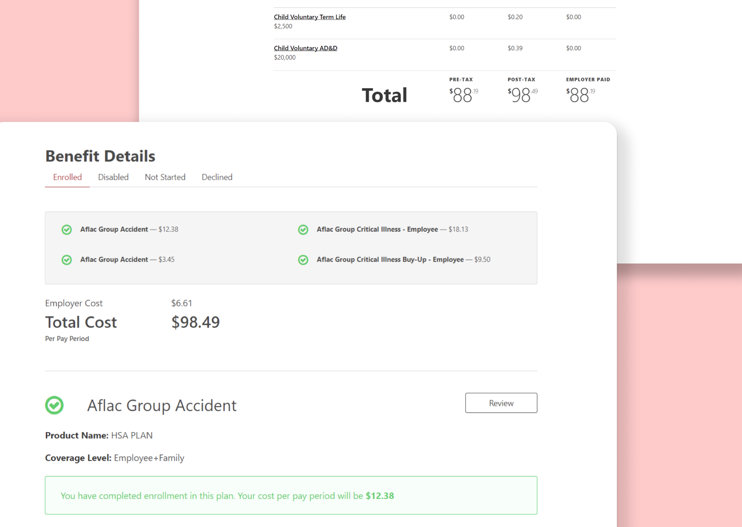
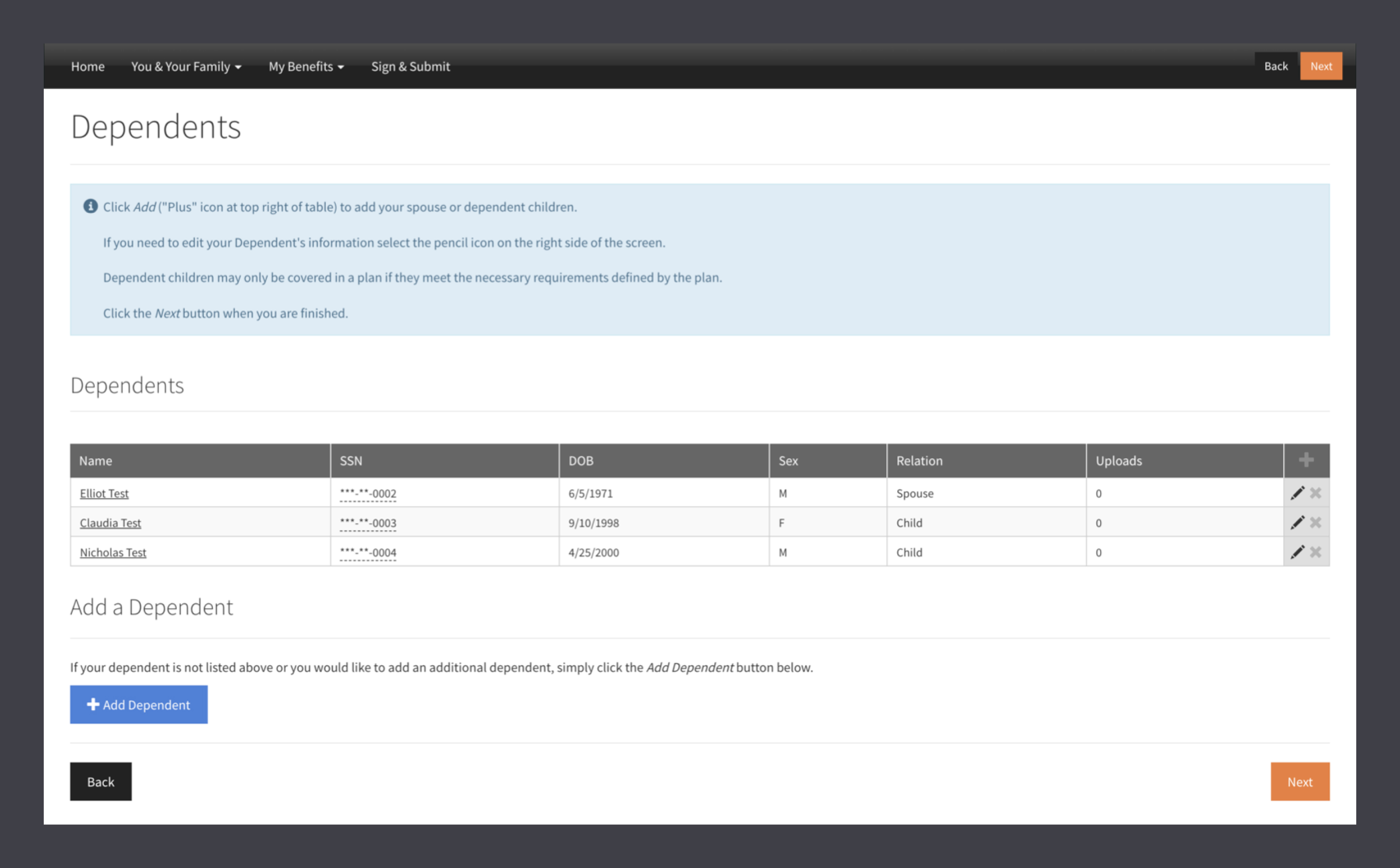
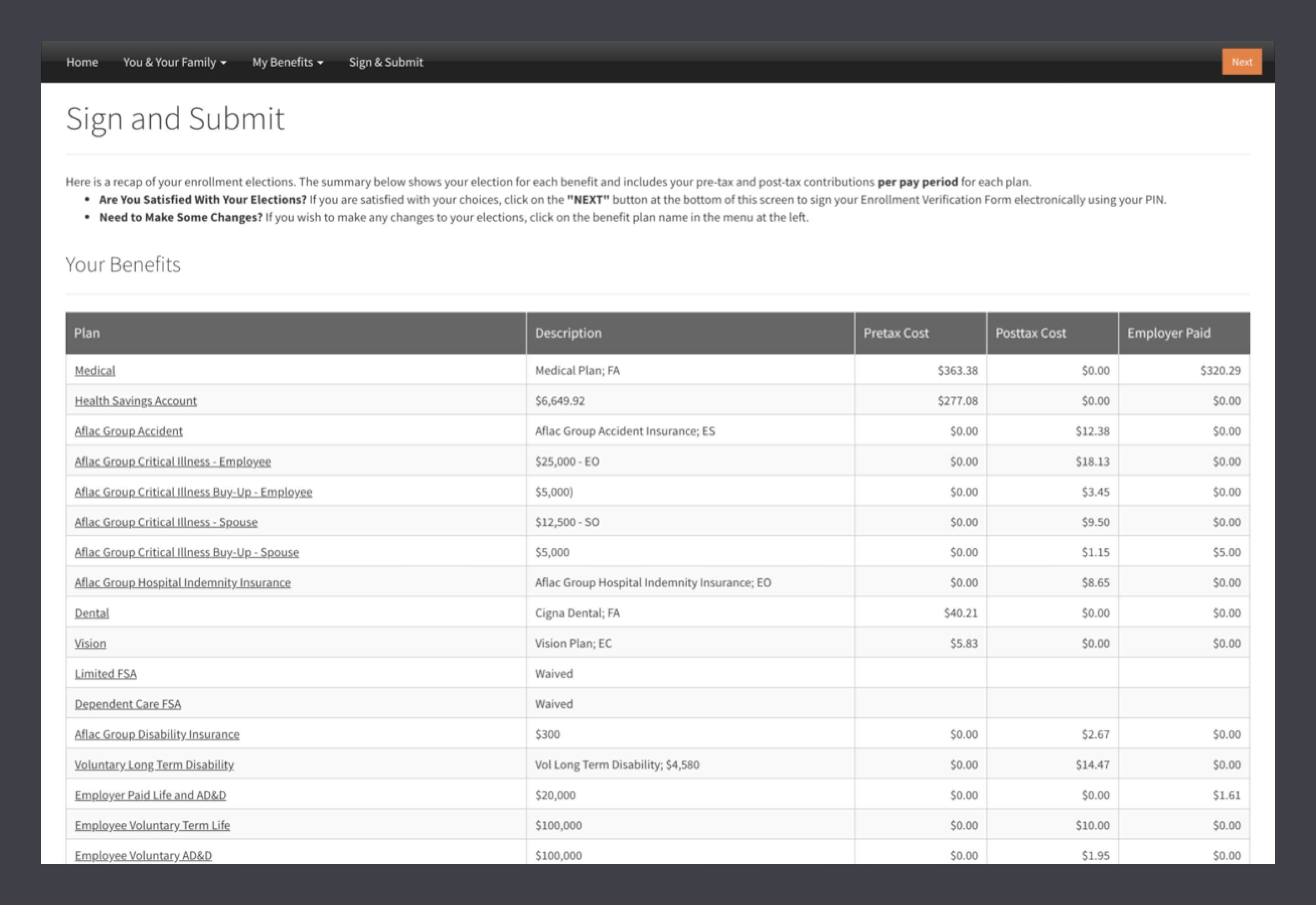
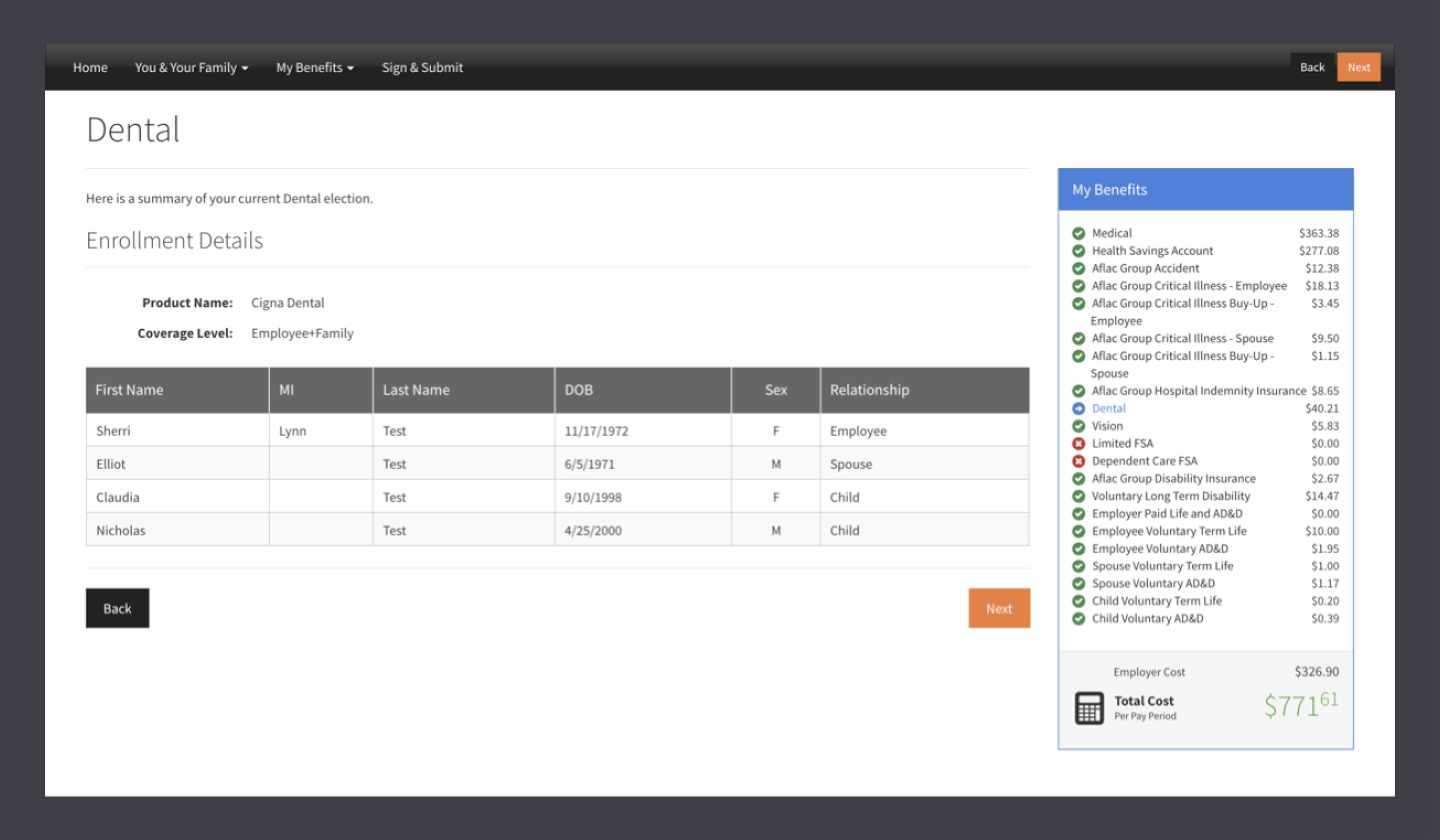
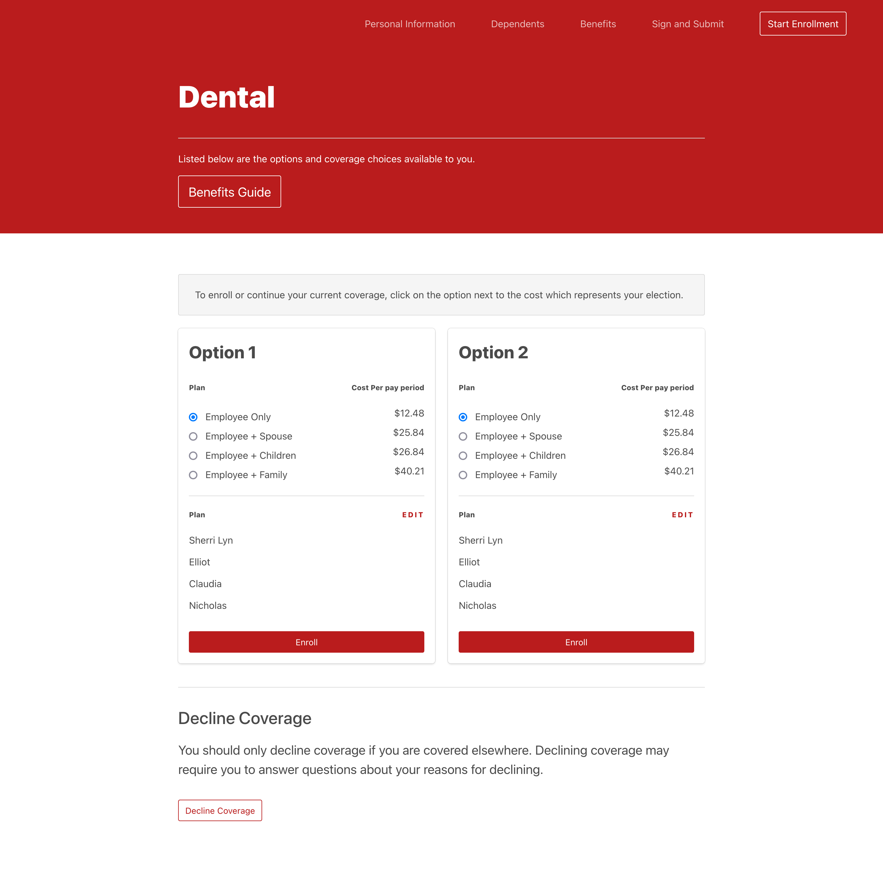
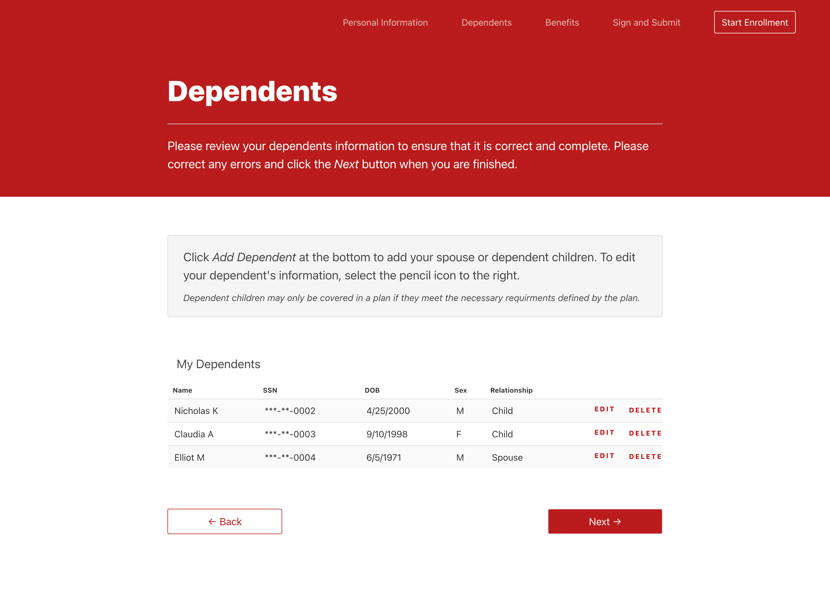
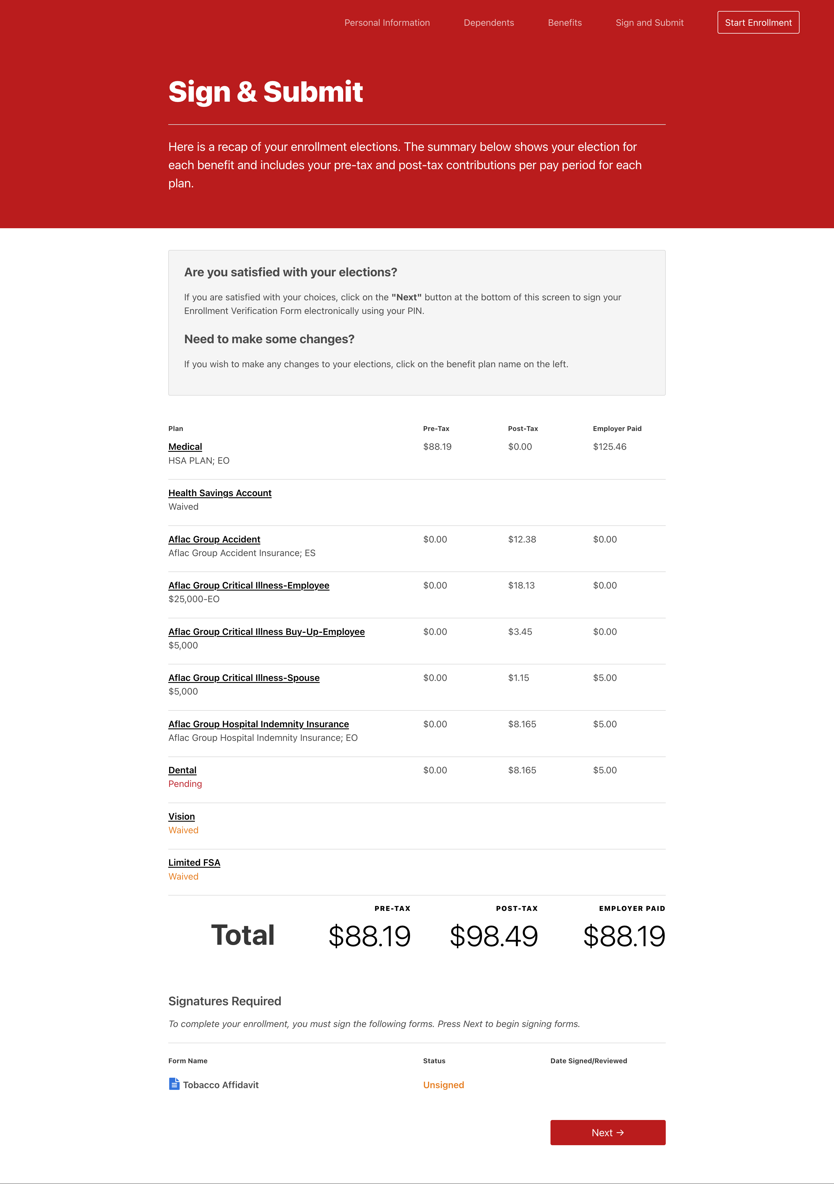
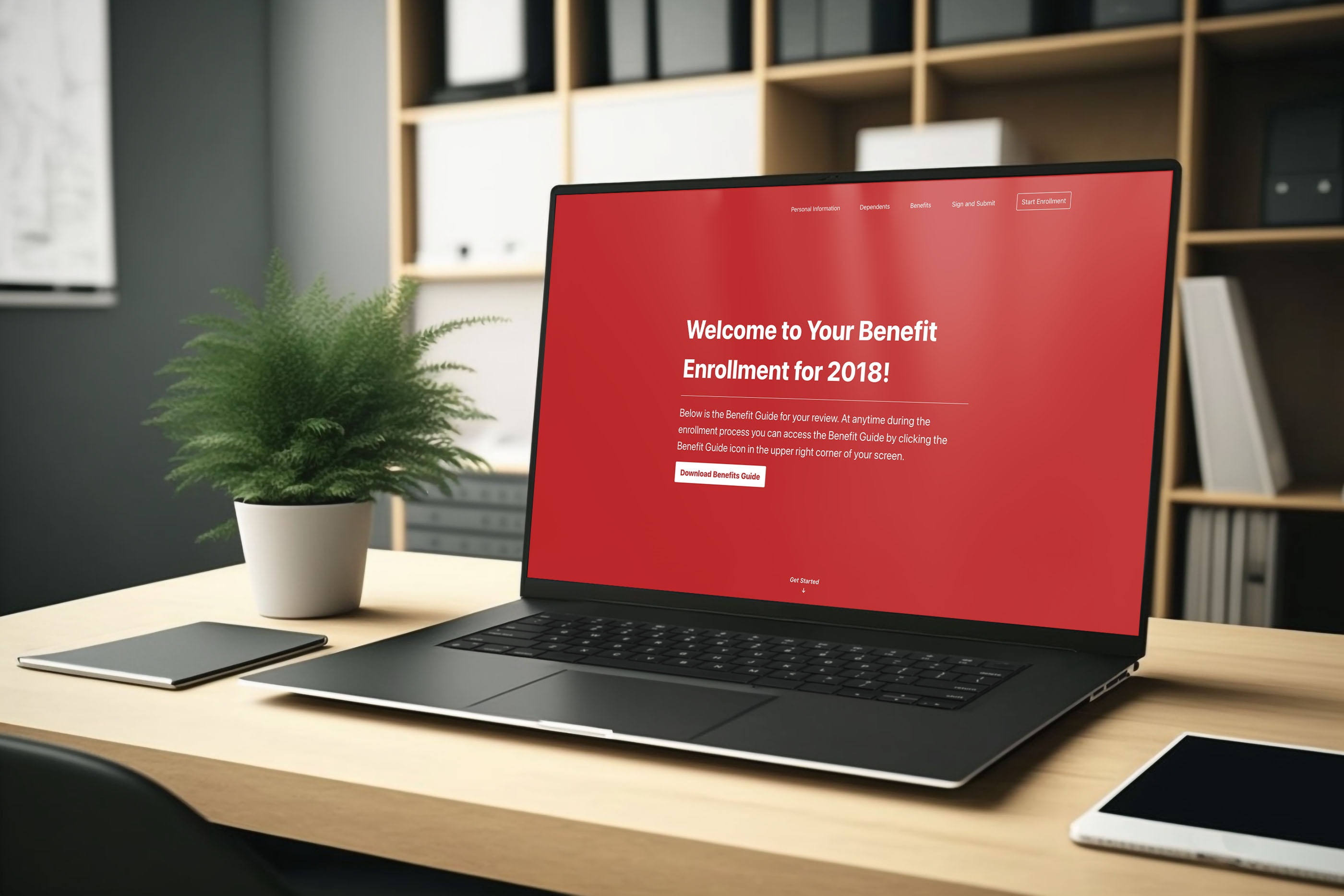
For this project, it was important to clearly outline goals from the beginning. After collaborating with the stakeholders, we all agreed on goals for the UI update. The scope of the redesign would be to keep all of the existing content, but update the look and feel, and also make it responsive.
Local Environment
For this site, I used npm scripts to serve, watch, and build the small project.
{ "name": "Lockton", "version": "1.0.0", "description": "Static Website for Lockton", "scripts": { "build-css": "node-sass --include-path scss scss/main.scss build/css/style.min.css", "build-js": "browserify js/**.js >build/js/script.min.js", "watch:css": "1onchange 'scss/**/*.*' -- npm run build-css", "watch:js": "onchange 'js/**.js' -- npm run build-js", "browser-sync": "browser-sync start --server build --files \"build/*.html, build/css/*.min.css\"", "browser-sync": "parallelshell 'npm run browser-sync' 'npm run watch:css' 'npm run watch:js'" }, "devDependencies": { "browser-sync": "^2.18.12", "browserify": "^14.3.0", "node-sass": "^4.5.3", "nodemon": "^1.11.0", "onchange": "^3.2.1", "parallelshell": "^2.0.0" }}Front-End Design & Working Effeciently
For this project, I opted to skip the high-fidelity mockup phase. A lot of the value that would come from this update would happen by following a system and applying modern web styles. After documenting the existing interface and sketching basic layouts, I dived right into building the front-end.
Below you can see some of the code I used to create a systematic approach to typography styles.
    //==================================
    // set base typography
    //==================================
    $sans: -apple-system,'Segoe UI', sans-serif
    $mobile-body:  12px,
    $tablet-body:  18px,
    $laptop-body:  20px
    $desktop-body: 21px,

    body {
           * {
               font-family: $sans;
           }
        }

    //==================================
    // type scale
    //==================================

    $3xl:  3.157em;
    $2xl:  2.369em;
    $xl:   1.777em
    $lg:   1.333em;
    $md:   1em;
    $sm:   .75em;
    $xs:   .563em
    $2xs:  .422em;

    @media (max-width: 768px) {
           body {
               font-size: $mobile-body;
            }
           .type-2xl-mobile {
               font-size: $2xl-size;
           }
           .type-xl-mobile {
                   font-size: $xl-size;
               }
               .type-lg-mobile {
                   font-size: $lg-size;
               }
               .type-md-mobile {
                   font-size: $md-size;
               }
               .type-sm-mobile {
                   font-size: $sm-size;
               }
               .type-xs-mobile {
                   font-size: $xs-size;
               }
               .type-2xs-mobile {
                   font-size: $2xs-size;
               }
    }
Getting There
By leveraging a modern front-end framework and applying systematic CSS styles, I was able to put together a modern design for the refresh that supports mobile, tablet, and desktop devices.
Closing Thoughts
Overall, the project was a success. The stakeholders loved the design and took my templates to use them on their website. One thought I couldn’t help shake was how would we know if this redesign was effective? Without proper user testing from the original to the new design, it would be hard to know if this work was helpful.
Going forward, I hope to implement user testing before and after a redesign, instead of focusing only on aesthetics.
©2025 Tyler Renfro