2022 | Research Artifacts
Heuristic Evaluation: Texas De Brazil
Summary: The following document is a heuristic evaluation of texasdebrazil.com, a website for their chain of restaurants that allows users to make reservations, order delivery or pickup, browse menu options, and find locations.
Overview
Heuristic evaluations help identify design problems in the user interface. For texasebrazil.com, the evaluation was judged in comparison to high-level usability guidelines known as the Nielson 10 usability heuristics.
Usability principles evaluated:
- Visibility of System Status
- Match between the system and the real world
- User control and freedom
- Maintain consistency and adhere to standards
- Error prevention
- Recognition rather than recall
- Flexibility and efficiency of use
- Aesthetic and minimalist design
- Help and documentation
- Help users recognize, diagnose, and recover from Errors
Usability Tasks to Help Discovery
To help uncover design issues that overlap with the user’s journey, tasks were created based on what users are likely to do on the website.
- Make a reservation at the Denver location for a party of two this Saturday @ 7:00 p.m.
- Submit an online order of any menu item for delivery.
- Find one vegetarian menu item and another that is gluten-free.
- Find the location nearest to you and contact them for a question.
- Sign up to the mailing list to start getting exclusive deals and offers.
#1 Visiblity of System Status
The design should always keep users informed about what is going on, through appropriate feedback within a reasonable amount of time.
Findings
Issue
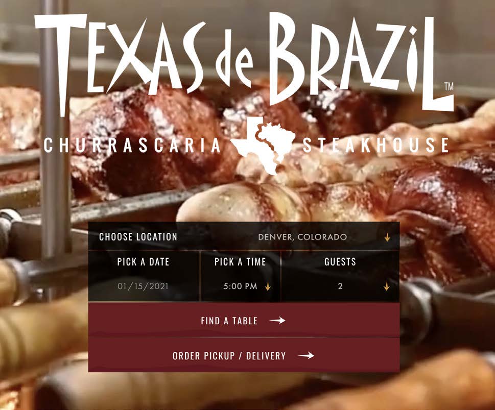
When selecting a date and time for a reservation, there is no indication of the restaurant’s business status—open or closed. Withholding information about the system violates this principal.
Suggestions
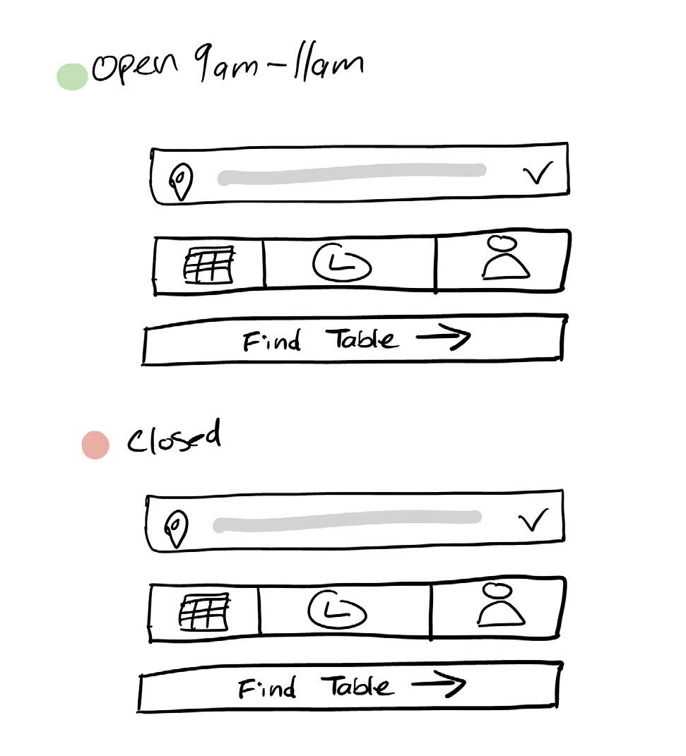
Subtext communicating the restaurant hours and status could help users start the reservation process with times that align with business hours.
Success
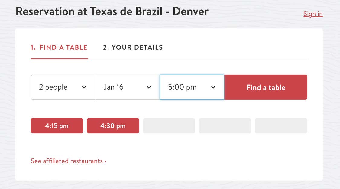
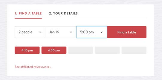
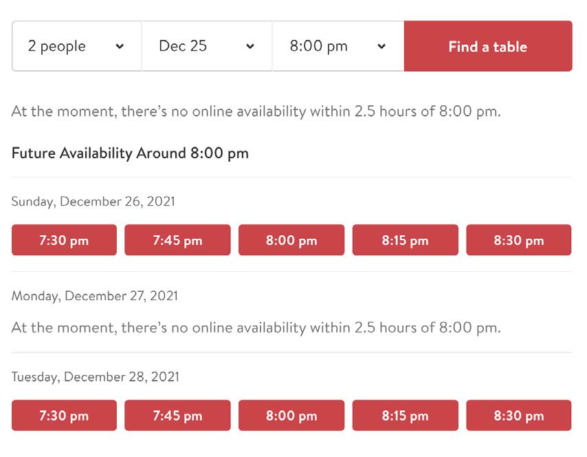
Following the journey of making a reservation, the third-party tool OpenTable does a lot right. If the selected reservation isn’t available, the app communicates unavailable times with disabled states and suggests other time slots.
#2 Match Between the System & the Real World
The design should speak the users’ language. Use words, phrases, and concepts familiar to the user, rather than internal jargon. Follow real-world conventions, making information appear in a natural and logical order.
Findings
Issue
While most things are named and labeled correctly on the website for Texas de Brazil, there is one item that could be better—group dining. The misnaming can create confusion about what the service is. Users may wonder if this is for large groups trying to make a reservation when it’s known as catering and should be named accordingly.

Suggestion
Change the name of the service from “Group Dining” to “Catering”. An easy fix, but it also makes the service consistent.
Issue
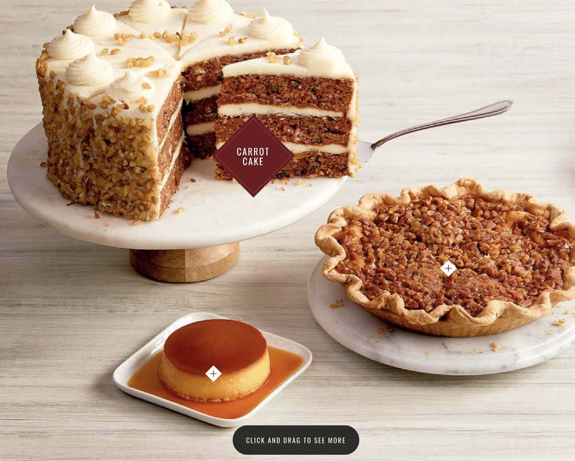
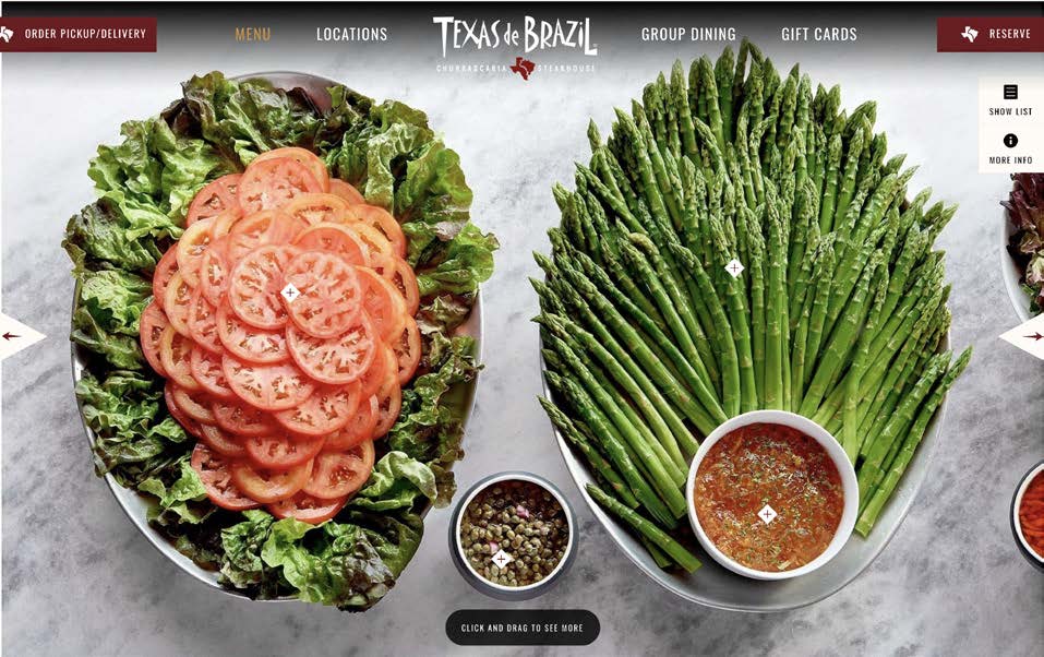
The form and function of the menu do not match how people use a menu in the real world. On the website, there are pictures of the food items in a row that requires horizontal scrolling, without pricing information, descriptions, or even names readily available (unless users request the item name by clicking a ‘+’ icon in the interface).
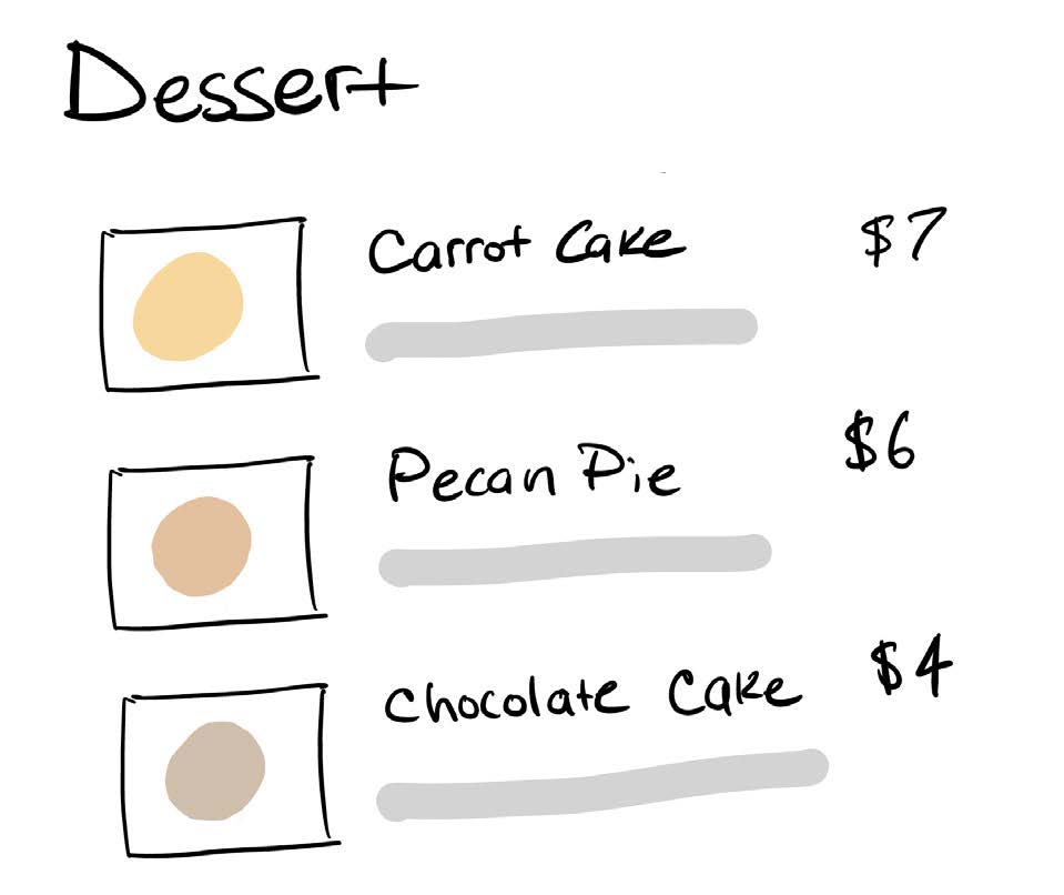
In life, menus are much more informative and designed for reading to help people make decisions. Menus are scanned from top to bottom with names of items, prices, descriptions, and photos.
Suggestions
Implement a simple and traditional food menu that includes pricing information, photos, and descriptions.
#3 User Control & Freedom
Users often perform actions by mistake. They need a clearly marked “emergency exit” to leave the unwanted action without having to go through an extended process.
Findings
Issue
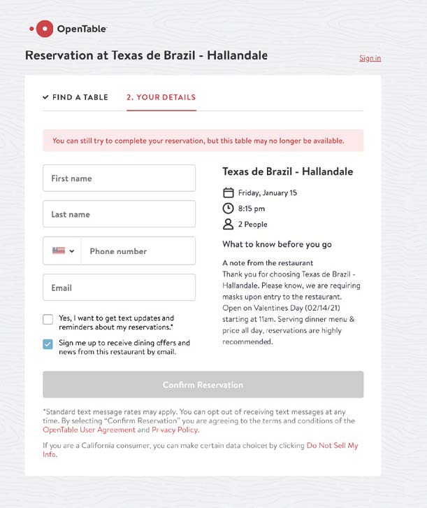
Since Texas de Brazil relies on third-party software for ordering pickup or delivery, the journey is a separate experience. As a result, if a user changes their mind about ordering, or wants to make a reservation in person instead, they can’t. To reset the journey, users must click the back button in the browser or the logo in the main navigation.
Suggestions
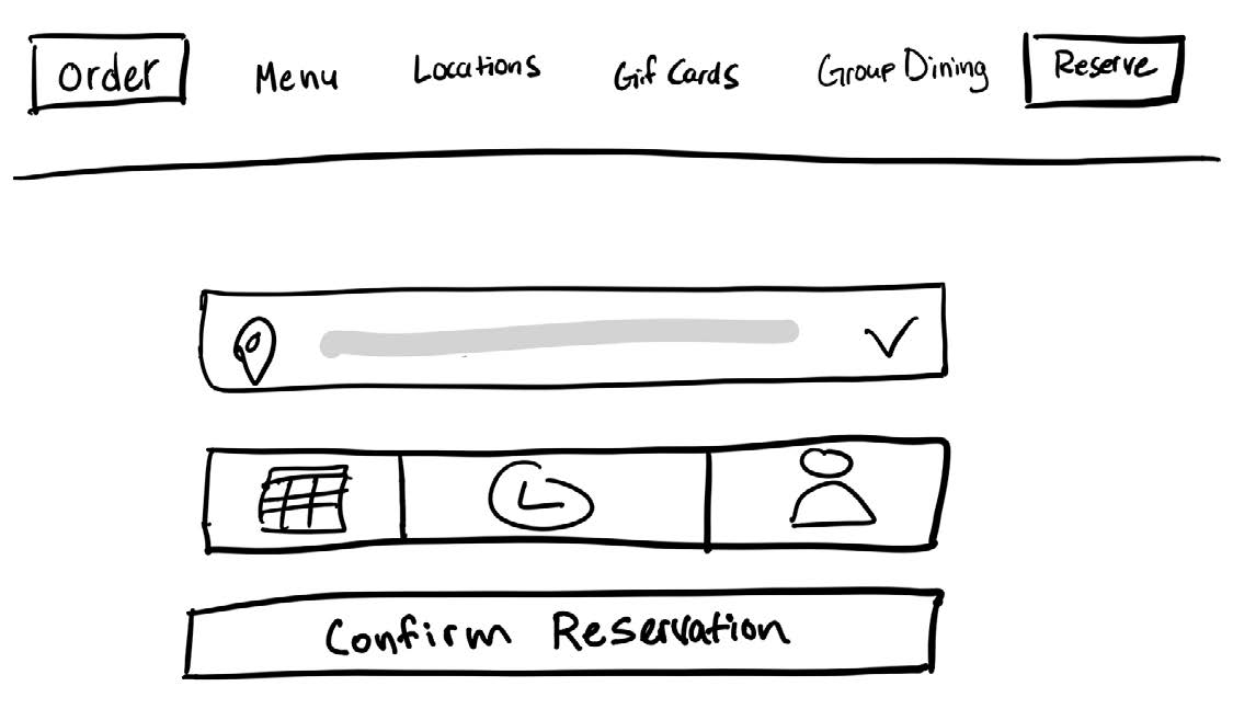
Replicating the main navigation of the website with the reservations/online ordering pages could give users more flexibility. With this change, users could easily switch to do anything the website offers.
Success
Overall the website navigation and structure support user control and freedom when it comes to browsing the site. The consistent top-level navigation items make it easy to exit the page to go somewhere else or go back to the previous state.

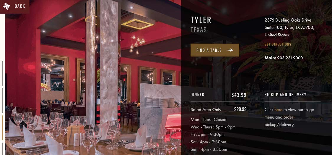
Even on the nested pages, there is a supporting UI component that takes users back to the previous page.
#4 Maintain Consistency & Adhere to Standards
Users should not have to wonder whether different words, situations, or actions mean the same thing. Follow platform and industry conventions.
Findings
Issue
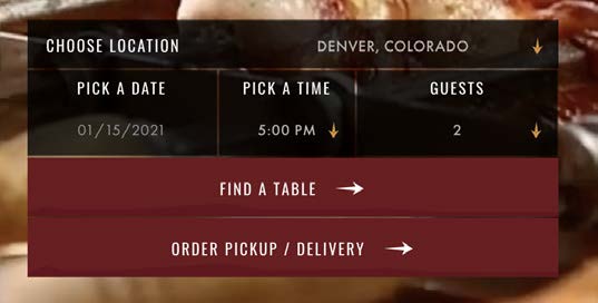
Internal consistency suffers from relying on third-party software to build the online systems for Texas de Brazil. The UI from the website design doesn’t match the UI of components you see for making a reservation and ordering online.
Suggestion
Invest in the software. Texas de Brazil likely has little to no control over much of the third-party services they rely on. The only way to get around this would be to build and leverage their online apps and technology.
Issue
External Consistency. The website has unique branded UI components that do not match what users see on other websites. While this is mostly okay, conventional UI components would have been better.
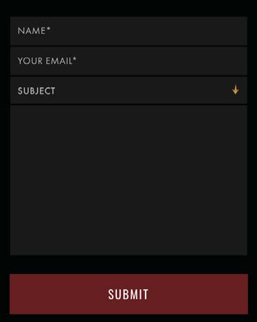
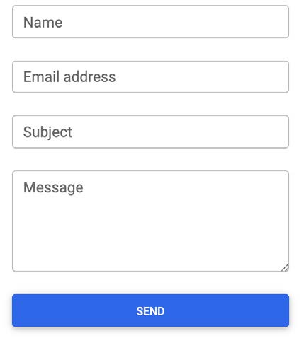
Comparing it to common UI form elements, it’s not drastically different. However, it is enough to make someone think and take a look at the form to realize what it is.

Some areas on the website start to get questionable if they are buttons or not.
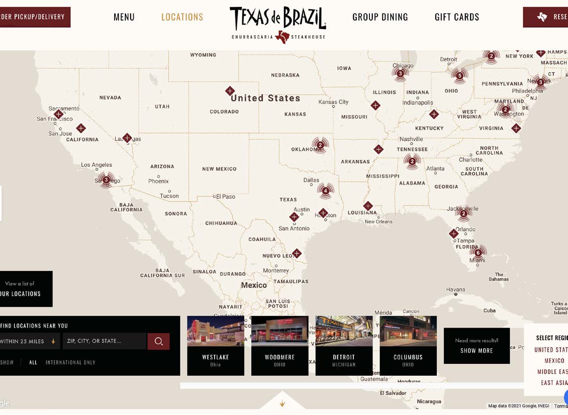
The biggest violation of this principle is on the locations page. There’s a large map with all the locations spread out, but unfortunately, the form for filtering and searching is at the bottom of the page. For most searching interfaces, controls are placed at the top.
Suggestions
- Simplify UI components when it comes to inputs and buttons.
- Place the location search controls above the map.
#5 Error Prevention
Good error messages are important, but the best designs carefully prevent problems from occurring in the first place. Either eliminate error-prone conditions or check for them and present users with a confirmation option before they commit to the action.
Findings
Issue
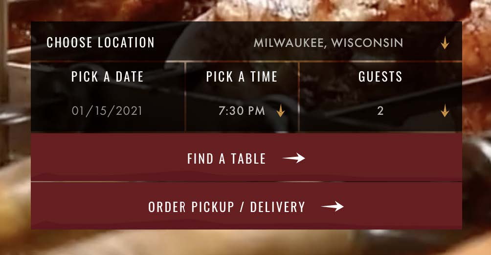
The default selected restaurant location does not consider where users are located. This is a problem because it’s easy to start the reservation process for a date and time at the wrong location.
Suggestions
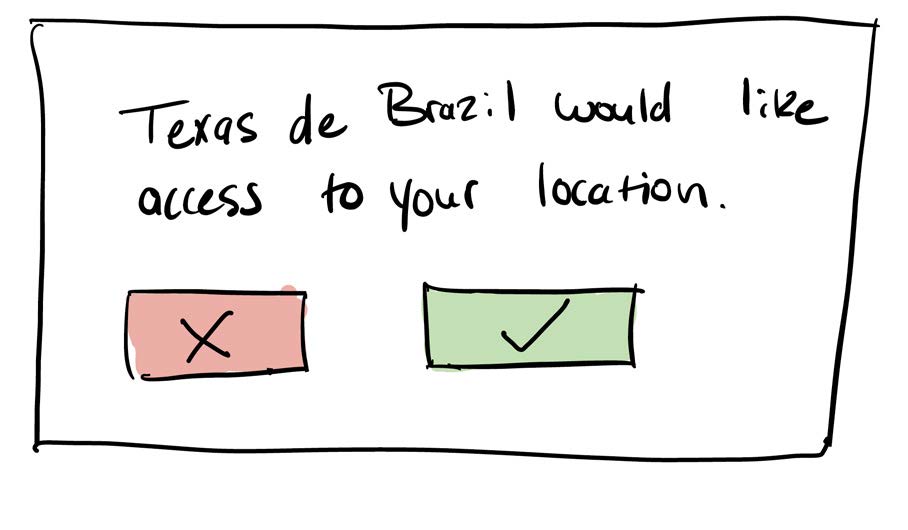
One solution could be requesting a user’s location and populating the default location to be the one closest to the user.
Another could be to leave the select blank and allow users to select a location before starting a reservation.

#6 Recognition Rather than Recall
Minimize the user’s memory load by making elements, actions, and options visible. The user should not have to remember information from one part of the interface to another.
Findings
Issue
The names of food items are only available by request. Users must recall menu items from the previous page and show the actual menu item name one at a time from clicking a photo.
Suggestion
Without doing an entire menu redesign, a solution could be to keep the names of menu items always visible.
#7 Flexibility & Efficiency of Use
Shortcuts—hidden from novice users—may speed up the interaction for the expert user such that the design can cater to both inexperienced and experienced users. Allow users to tailor frequent actions.
Findings
Issue
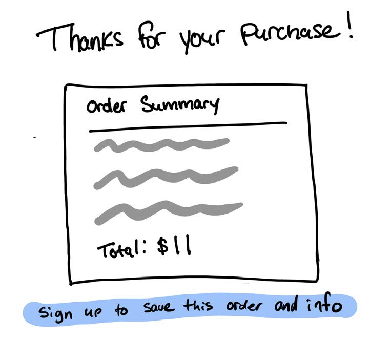
Lack of accelerators for repetitious usage. Texas de Brazil doesn’t have much to offer returning patrons. This is a missed opportunity to capture engaged users and reward them with an easier checkout experience for repeated use.
Suggestion
Enhance the experience for returning online users by supporting account sign-up. By providing account information, returning users could save previous orders and payment info for faster checkouts and smoother transactions.
#8 Aesthetic & Minimalist Design
Interfaces should not contain information which is irrelevant or rarely needed. Every extra unit of information in an interface competes with the relevant units of information and diminishes their relative visibility.
Findings
Issue
There are multiple violations of distracting design that take focus away from users. The biggest problem is the background video on the home page. The constant movement naturally draws attention to the video instead of the form for making a reservation.
Another concern is readability—text is illegible because of the design aesthetics. The site contains a large amount of low-contrast text that is difficult to read.

Suggestions
- Replace the background video with a static image.
- Find all occurrences of low contrast text and adjust the design to make it pass AA compliance.
#9 Help Users Recognize, Diagnose, & Recover from Errors
Error messages should be expressed in plain language (no error codes), precisely indicate the problem, and constructively suggest a solution.
Findings
Success
This is something that texasdebrazil.com demonstrates consistent success in. Moments that stand out include: error notifications, requiring correct formatted information, and showing availability statuses.
Another example is the form for making a reservation. If time slots are unavailable, they are visually disabled, and the UI suggests other available times close to your reservation.
#10 Help & Documentation
It’s best if the system doesn’t need any additional explanation. However, it may be necessary to provide documentation to help users understand how to complete their tasks.
Findings
Issue
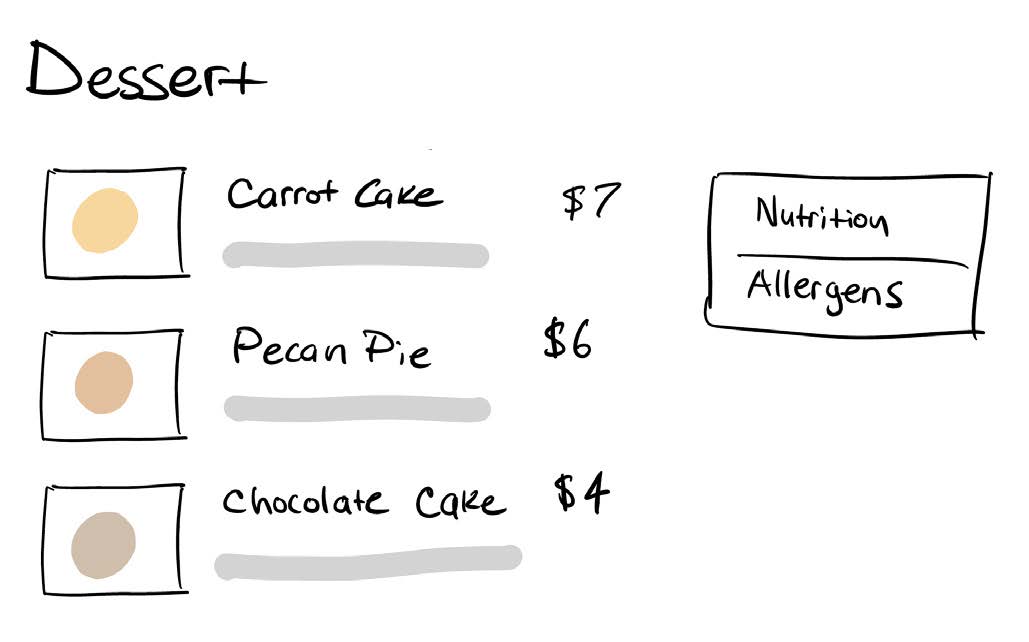
When searching for dietary restrictions, no information is found on the menu. However, at the bottom of the page in the footer, there is a tool for filtering menu items by dietary restrictions.
Suggestions
Make the allergy and nutrition tool more prominent on the menu page. Additionally, vegetarian and gluten-free labels on the menu would go a long way.
Issue
It’s hard for users to get help. Users have no quick and efficient way to contact the restaurants. Even on the contact page, the only way to reach out is to fill out a form. This process is not fast enough for users with questions that demand immediate answers.
There is contact information available for each location on the website. However, finding that information is a little challenging.
Suggestion
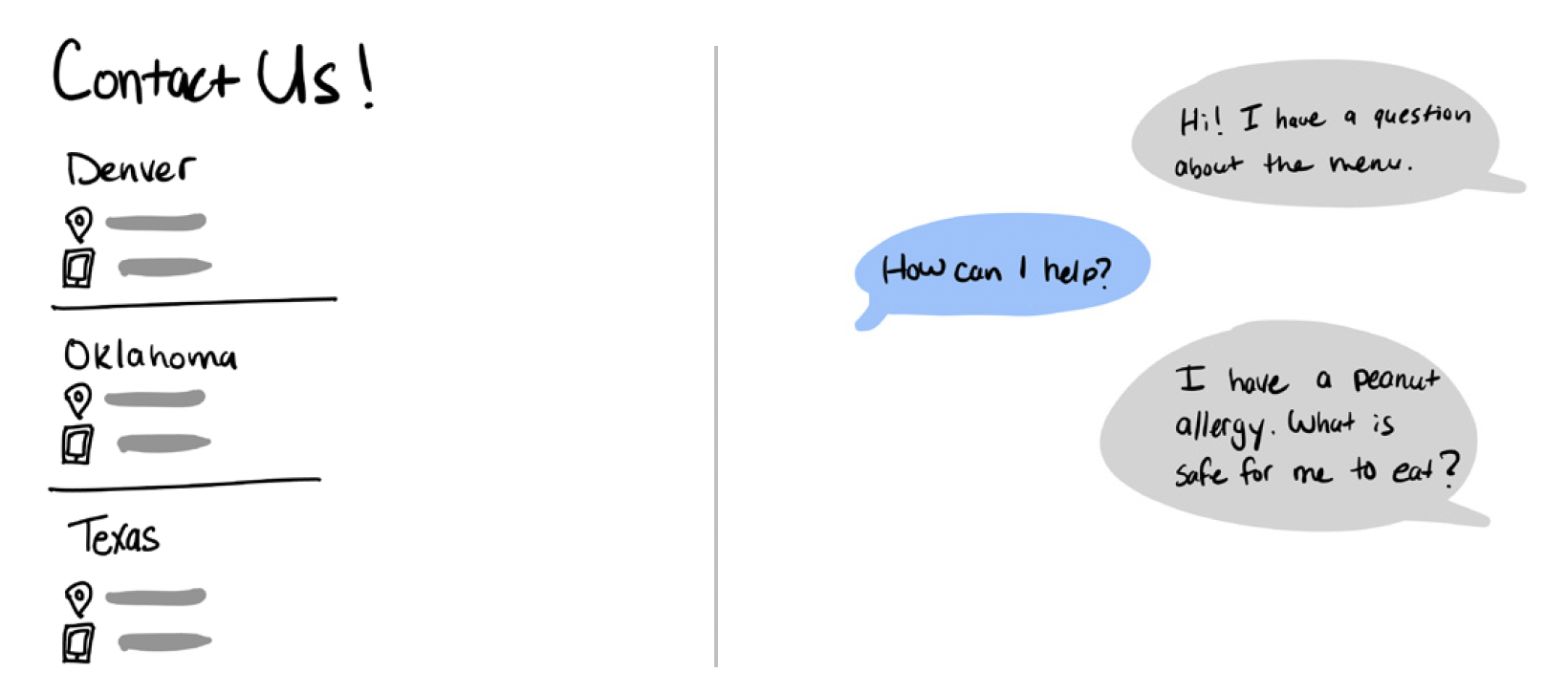
Add the contact page link to the primary navigation bar and on that page list out the locations by the state with their contact information.
Another solution to get users who need help quickly would be to add a chatbot that queues requests to a real person.
Conclusion
Ultimately, there were twelve individual usability problems identified. Of the twelve, two were deemed a “major issue”; two a “minor issue”; and three a “cosmetic problem”. This resulted in seven actionable redesign recommendations:
- Rename “Group Dining” to “Catering”.
- Redesign the menu to follow the form and function of a dine-in menu.
- Adjust the location search controls and move them to the top of the page.
- Introduce rewards for returning users
- Adjust component aesthetics to pass AA compliance
- Add vegetarian and gluten-free labels on the menu
- Add a chatbot that queues to a real person
©2025 Tyler Renfro